Typophoto and graphic design’s early years.
So
Ellen Lupton:many aspects of mass communication are designed to disappear.
Jess Brier:Art and design has its own life once it goes into the world, and that tension or that gap is really a fascinating one.
Ellen Lupton:Hi, Jess. How are you doing? Tell us what you're up to.
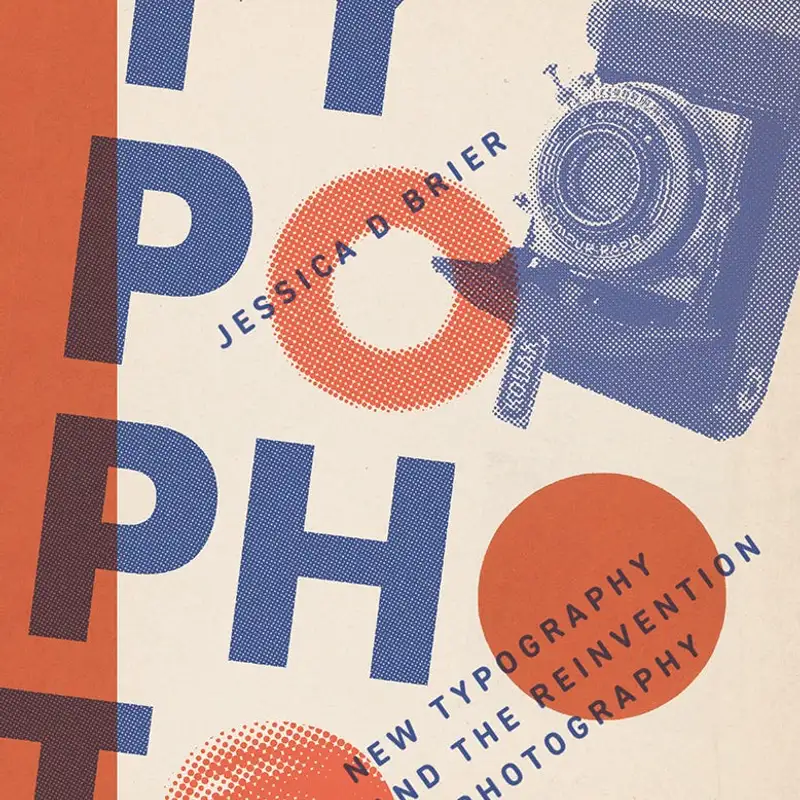
Jess Brier:Hello, my name is Jess Brier. I'm glad to be here with you Ellen. I am the curator of photography at the Francis Lehman Loeb Art Center at Bassar College up in the Hudson Valley in New York And I am now the author of New Typography and the Reinvention of Photography. So I'm really excited to talk about the book with you.
Ellen Lupton:I love your book. I'm Ellen Lupton, and I'm a graphic designer, writer, curator. I teach design history, and I'm fascinated by this period in history. And I think a lot of historians, art historians and designers will be familiar with the term photomontage. But your book is about something different, typophoto,
Jess Brier:which was a term used in the 20s by avant garde designers, but it kind of didn't stick around. So can you tell us what typophoto is? Sure. So typophoto was a word invented by Laszlo Moholy Nagy, who was a really fascinating artist and designer and teacher at the Bauhaus. And while he was at the Bauhaus, he wrote a book called Painting Photography Film in 1925 and it's actually one of the most important texts on photography written in the 1920s.
Jess Brier:He was an incredibly prolific writer and theorist and in that book he introduced the term typophoto or typophoto in German. It's great to have a book title that's a made up German word. Basically his explanation of that was pretty simple. It was the synthesis of typography and photography And he actually predicted interestingly that images would replace text ultimately as a form of communication. He really believed in newer media.
Jess Brier:Photography was still relatively new at the time and the mass circulation of photography was much more new. He predicted that eventually we would stop using type and text and we would use images as forms of communication, primary forms of communication. So I often think of this when I use an emoji or something. You know, I think he'd be really fascinated by the world that we live in now. He was a real believer in new media.
Jess Brier:You know, even though he was talking about how text would eventually be obsolete, the term was picked up by graphic designers. Jan Schuykold, who's an important figure in this book, he was a really prolific graphic designer of the period who you know well, Ellen. He picked up this term and adopted it as a principle of what he called the new typography. So this new movement of avant garde design and he wrote a kind of manifesto on the new typography that same year 1925 and one of its core principles was that photography should be used as a means of illustration. So he kind of assimilated Mahalin Naj's idea and turned it into a principle for graphic design.
Jess Brier:So that's really the meat of the book.
Ellen Lupton:Yeah. And he got the word new typography from Maholy Nagy too, right? So Jan Cicchold visited the Bauhaus in 1923, and he picked up this amazing book, the catalog of the big Bauhaus exhibition designed by Moholy Nagy that featured a manifesto of typography called The New Typography. So it's such a great story. So you make an argument that photography as a discourse and a practice was fundamentally changed by photomechanical reproduction.
Ellen Lupton:And what is the core technology of that transformation?
Jess Brier:So the technology that transformed photography for graphic design and for printing was a halftone process. So this was actually a process that was invented in the 1880s. It essentially allowed the mass printing of photography on the same plate as type which really was a kind of game changer for being able to mass reproduce photographs and photographs would be re photographed through a screen, the halftone screen. So halftone really refers to what happens to break up the tones of the photograph and turn them into tiny dots. Every photograph as you know that's printed with offset printing in books and magazines in any printed ephemera those are half tones and I find them fascinating because in order to see them properly there is an optical illusion that happens.
Jess Brier:So we're actually able to not look at the dots, but just look at the image. So halftone refers both to the process and to the image, a halftone photograph, for example.
Ellen Lupton:And yet we don't notice it. And so many aspects of mass communication are designed to disappear. Right? So when we read a book, we're not thinking about the fonts. When we look at a photograph, we imagine the diva on the beach, not a photographer taking a picture that then gets processed and retouched in all these artificial means.
Ellen Lupton:We are delivered the appearance of reality, right? Or what Walter Benjamin, the Orchid in the Land of Technology, right? It's so beautiful. And yet so many people aren't aware that the halftone had such an impact on the world and is still so active today.
Jess Brier:And of course, we live in the world of digital pixels now, right? So the halftone also preceded the atomization of images on screens, right, that we look at every day. And I think that that idea of something designed to disappear, as you're saying, Ellen, this is exactly what I'm fascinated by both the halftone and graphic design in general, right? These things that are not meant to be looked at critically, I think are exactly the things that we should be looking at critically. And so I was really excited to kind of bring an art historian's eye to these things that are, as you say, meant to disappear.
Ellen Lupton:And the halftone technology, so it was introduced in the 1880s. It's older than the artist that you're writing about. So it was new, but not really new. Right? It's sort of like my kids growing up with the internet.
Ellen Lupton:So what did these avant garde artists they come of age in a world that's already littered with halftone photography. Mass media is already there, right? It's the water. It's the air. What did they do to make it different and to create this revolution in visual communication?
Jess Brier:So the halftone had existed for a while but it was still not great. We often think about, I think we have this myth that photography immediately replaced, you know, sketch reporting in newspapers and actually that was kind of a longer process. People would complain when they saw half tones in the newspaper at first that they were too screeny, quote
Ellen Lupton:unquote. Because they could see the texture, right?
Jess Brier:Yeah, yeah, it was it was really distracting and of course they were used to sketch reporting that was considered, you know, a reliable source of visual information. So it took a little while and then offset printing really changed the game for mass communication and offset printing is something that these designers were very adept at using and designing for offset printing. So this was really a much more sophisticated kind of printing. This is how books are still printed today And with offset printing they were able to experiment a little bit more with the form of the halftone. So the aesthetic experimentation that they did with the halftone was you know, once it had been perfected, people couldn't see those dots anymore.
Jess Brier:Then they thought, well, why don't we blow it up again and make it, you know, 10 dpi. And they started to really play with the form of the halftone itself. And it became a form that communicated ideas about technology, about printing. They were really showing off what they could do with offset printing.
Ellen Lupton:And sort of exposing the medium.
Jess Brier:Yeah, exactly. Exactly. And celebrating technology, which is why they were so excited about photography, right? This was about what the machine could do, right? What they could do as craftsmen working with the machine.
Jess Brier:So that was both the printing machines and also the machine of the camera.
Ellen Lupton:And so, Mahal Naj in that essay, he talks about photography as objective. He uses this beautiful phrase, the hygiene of the optical. And so this is a belief and an ideology about the truth value of photography. And that kind of shifted over the course of the 20s had really disappeared by the 30s. You talk about this conflict between the objective and the subjective, the propaganda and manipulation and psychology?
Jess Brier:Absolutely, yeah. So as you say initially there is this belief in photography as truthful and and objective and this is really what Moholy embraces And over time, well he writes about typophoto in his manifesto, The New Typography, as I mentioned, and that is really kind of telegraphing this idea of photography as exact and objective. But then the way that these principles of new typography are used is for advertising. So the kind of main vehicle for this new kind of design is meant for persuading consumers to buy things. These designers are making design for the purposes of consumer propaganda.
Jess Brier:The way that they actually use photography is really not very objective. They are more and more embracing photo montage literally cutting and pasting pieces of photographs reconfiguring them on the page, using retouching to manipulate those fragments of photographs to make advertising that looks very different from advertising today but it's familiar in the sense that it's very associative. It's meant to evoke emotions and abstract ideas, not so much pure objective facts, right? That's not really the effectiveness of advertising. Advertising is effective because it makes us feel things and it makes us remember things that are strange and interesting, right?
Jess Brier:I speak to students about advertising and the ads that they remember are, you know, the geico gecko, which has nothing to do with insurance, right? But it's, it's a funny animal that talks, right? These are the tropes of advertising, things that catch our attention, that seem strange and kind of surreal and absurd, right? So that is something that I find really fascinating with these designs that they're talking about objectivity and yet they're making designs that are kind of surreal and bizarre and anything but objective and they're really using photography to do that.
Ellen Lupton:So, Moholy Naj wrote about how type could become photographic. So the halftone process was literally about turning photos into type that could be printed letterpress or offset. But initially letterpress at the same height as metal type. This was revolutionary because before 1880s you couldn't put a photograph and type together. So the halftone literally turned photographs into typography, into a typographic block, a process block.
Ellen Lupton:But Moholy Nagy also wrote about how typography could become photographic. And there are some beautiful this is more experimental and certainly not part of mainstream advertising. It's more of a thought experiment and a technology experiment. And there's some beautiful examples of this in your book. Can you try to bring to life in our listeners' minds what some of these type as photo experiments look like?
Jess Brier:Yeah, so more and more they were experimenting with photography in lots of different ways. So I mentioned photo montage. Another kind of experiment was with what are called photograms, so camera less photographs that are made by placing objects on photosensitive paper, exposing them to light, and they would do this sometimes with stencils. So some of these designers including Moholy Nagy, the Russian designer El Lizitsky who was prolific in this period and Jan Chikholt all made designs some of which were printed most of which were just kind of experiments that they did in their their studios that I found in archives. But these were were photograms that were really mostly typographic but they were made through through this photographic process.
Jess Brier:And then there are some other lots of other examples of actually using layering halftones on one another in ways that kind of play up the way that light passes through objects in a sort of photographic way. So really using the language of printmaking to then evoke the idea of photography of kind of light and shadow playing and then a lot of kind of experiments with creating designs where there's a kind of reversal of positive and negative so using white and black contrast and really evoking the again the idea of photography not necessarily the medium of photography but using typographic forms and processes to do that. So I kind of discovered this whole world of typo photo beyond beyond simply putting type and photographs together, right? This other layer of meaning behind typophoto, as Mahalin Naj wrote about.
Ellen Lupton:Right. And the overprinting of type onto pictures was definitely an emerging language mass media that wouldn't have been typical in a newspaper in the 1890s, for example. There's a particular font from the 20s that was marketed to designers and printers as the ultimate typeface of photo montage. This was the only font you should use if you were serious about photo montage. Tell us about that font and who created it.
Jess Brier:So the font is Futura. It was the predecessor of all of the sans serif typefaces that we see today, including Helvetica, which is probably familiar to most of our listeners. This is a very commonly used font especially for commercial design. Futura was invented by Paul Renner in 1927. As you say it was marketed as the perfect companion to photo montage and photomontage the perfect companion to Futura.
Jess Brier:And of course the name says everything about the intention of this font. Sans serif type like photography was thought of as a modern type by these graphic designers. Sans Serif indicated futurity, futura, modernization, utopia, a kind of new future that they were interested in creating.
Ellen Lupton:And Futura is more than just sans serif. It also has this very strong geometric identity. Like the O's are perfect circles or seemingly perfect and the M's are triangular. This made it very different from the so called anonymous grotesques that were the alternative to Futura that had already existed. You could find in a normal print shop these sort of sturdy workhouse grotesque sans serifs.
Ellen Lupton:But Renner wanted to create a truly modern sans serif. And Futura today remains one of the most popular typefaces in the world. And in fact, many of our listeners, if you look at your font menu, there will be a version of Futura in your list of loaded typefaces on your computer. So if you want to be modern, try Futura. Helvetica is a bit more speaking back to that anonymous sans, and Futura embraces the geometric ideology of the Bauhaus and functionalism at its height and is still just so popular.
Ellen Lupton:And in fact, when NASA landed on the moon, the sign that they put there is printed in Futura.
Jess Brier:I didn't know that. That's fascinating.
Ellen Lupton:The future. Yeah. One of my students wrote an incredible book called Never Use Futura because it's sort of a truism in art school to avoid using this font because it's overused. And anyway, he did this beautiful history of Futura that I highly recommend to all of you. Great.
Ellen Lupton:Never use Futura. And Renner actually founded his own art school or taught in an art school that was quite different from the Bauhaus. So tell us about that art school.
Jess Brier:Yeah, so in 1927 Paul Renner was living in Munich which was not a city particularly associated with modernism or avant garde art and design but there were some really interesting people living there and who moved there because of the founding of this school. So Paul Renner founded the Meisterschule fur Deutschland's Buchtruke which was there's not a great translation for Meisterschule but master school is about the closest we have in English. So the school for German book printers. So the school is actually founded to train future proprietors of printing houses. So they were learning about new print technology but also scientific business management which was a fairly new field and also of course the traditions of typography, schwift form, letter form, a design which has a long and very proud history in Germany.
Jess Brier:So it was really this marriage of kind of deep German traditions of typography with this very modern education in printing and in business. Paul Renner taught there and eventually Jan Chichold taught there as well. So this is how I learned about the Meister Schule. This is not a very well known school, unlike the Bauhaus but one of Chichol's archives holds a number of papers and student designs and faculty designs from that program and I really became fascinated by it because this is where a lot of halftone experimentation was taking place.
Ellen Lupton:It is an incredible student work in your book. Tell us about that. Help us see it.
Jess Brier:Yeah, so I'm going to look at these images while I talk about them because they're really great examples of what we've been talking about, you know, print offset printing especially and and letterpress to show off what design can do and what printing techniques can do. So overlapping montaged half tones blowing them up showing the dot pattern overlapping different colors so of course only one color could be printed at a time so we have there's this great design by an unknown designer that features these fragmented half tones. They're flowers. One is printed blue, yellow, and red. And then of course they make green and a kind of purple as as they overlap one another and it's it's really just this kind of it creates this kind of abstract bouquet of color and type and and flowers and it's really just showing off you know what they can do with with print with color and with the halftone.
Jess Brier:So other sort of experiments you know around making making type more photographic, making photographs more typographic. I mean this was really a rich territory for experimenting and of course these are student assignments so what better place to do that experimentation right? These are not commissions for a job these are not for clients so I think some of the richest experimentation actually happened in this setting, in this educational setting, which is a real testament to the pedagogy.
Ellen Lupton:Yeah, and that piece is really a demonstration of the printing process, thus exposing the process, which is also intriguing in relation to psychological theory at the time. And you have a whole chapter about the psychology of perception. And it has always fascinated me that the kind of scientific diagrams used to demonstrate perception then became a model for what a good logo should look like, you know, or what an icon for a bathroom sign, you know, all those things feed on the language of the scientific diagram, the demonstration. So tell us about perceptual research.
Jess Brier:Sure. So one of the rabbit holes I had to go down for this project was to understand what these designers meant when they talked about legibility. So they were very insistent about the legibility of sans serif type and also of about the legibility of photography. So I thought I had a sense of what that meant. I knew of course some of the associations they were making with photography but what does legibility mean?
Jess Brier:What does it mean for something to be more readable? And where this led me was to to look at applied psychology research. This was a huge field in the early part of the twentieth century And it was a very experimental field. So graphic design is also a new field in the 20s. It's really just kind of finding its footing.
Jess Brier:And so to lend credibility to this new field, they're looking to science to say, this is what research says about what is legible. Now what's interesting about applied psychology is that it is largely funded by the advertising industry. And so what legibility means is efficiency, speed, right? The kind of reading that we want people to do when they read advertisements is fast, right? They are flipping through a newspaper or a magazine or looking at a billboard.
Jess Brier:These are the forms of advertising in the 1920s. We need to make things readable very quickly and then we need things to be memorable. And so they created lab experiments to try to replicate the conditions of reading but of course in a very artificial way. No one is hooked up to an eye tracking machine when they're reading a magazine for example so they would create these kinds of apparatuses which by the way relied on photographic technology to do things like eye tracking. To learn about how the eye moves around an image to think about the legibility of images and they devised all kinds of these experiments and they as you say they're often using abstract images that then become the kind of prototype for logos later on.
Jess Brier:So it's really feeding right into the advertising industry both in its funding and in its application, right, it's applied psychology. This is what they mean by legible. They mean efficient. The new typographers also use the word economic, which is not an accident, right? Very much the language of capitalism is behind this.
Jess Brier:And you know you can imagine another kind of legibility. Know when you read a novel, for example, you might choose to read slowly because it's a really enjoyable experience. And I find these ads to also be things that I want to linger on. They are interesting to look at for a long time. They're not meant to be looked at closely, but there is another kind of experience that comes out of looking at them very closely.
Jess Brier:So the legibility they were after was something quite specific. And these experiments ended up becoming as I said kind of the backing for those ideas of graphic designers and they circulated through more kind of popular psychology texts that then were picked up and quoted in trade journals for typographers, for printers, for graphic designers.
Ellen Lupton:And were there principles that were really useful? Like I think I've read a lot of legibility studies related to type, which basically everyone wants to prove that sans serif type is more or less legible, and all of this stuff has basically failed. Were there principles related to the legibility of photography that are really legitimate or useful?
Jess Brier:Well, not really. Where photography was very useful to applied psychology was as a metaphor for what happens in in perception. So photography at this time especially in the 20s and 30s was often talked about as a surrogate for the human eye, A kind of Uber version of the human eye, something that could faithfully record what it sees and imprint itself, right? That's literally what happens when you make a photograph. And that's how they understood memory to work, that you would see something and if it was memorable enough, it would imprint itself on the mind.
Jess Brier:They were speaking metaphorically about the workings of memory and using photography as a way to visualize that and materialize that. They were actually understanding images to be imprinted on the mind as though it's a piece of paper, right? As though it's a substrate that you could print on. They talked about memory value and it's again no coincidence that the word value is being used. They would talk about attention value, memory value, things that were quantifiable and therefore were able to be monetized ultimately.
Jess Brier:So photography was very useful to them both as a technology for studying reading and perception and also as a metaphor for helping them to communicate what the results of these studies were. And then of course, they were also using halftone printing to reproduce the images that they were using as scientific evidence, right, as pieces of evidence for this research.
Ellen Lupton:So you talk about this oscillation between reading and seeing that is part of how we perceive photography. Of course, it's essential to reading itself, to type, that we are reading the words and therefore forgetting the phonetic system and certainly the font. But then we flip back and forth between this ability to see the form on the page or on the screen and the seeming transparency of absorbing the language in the case of typography. Tell me how that works with photography, the seeing versus reading, this oscillation. It seems like that's one of your arguments in the book.
Jess Brier:Yes, this is something that these designers are doing with both type and photography is really playing with, you know, the fact that obviously all letter forms are also visual images, right? They are put together to make text and we understand how to read them as such because we learn how to read. But we also read images and they were very aware of that and again this kind of association of photography with truth with the idea that photography is a form of information, visual information, this really lends itself to this idea that we also read images. And it's interesting because reading images means interpreting images and you wouldn't think that they would really want to leave a lot of room for interpretation. Again, we're talking about advertising, we're talking about commercial design that's meant to be glanced at and then remembered later.
Jess Brier:But there is a kind of labor involved and this is what I find really interesting about all of these experiments is it really highlights how much work the reader has to do as a reader, as a viewer, right? The oscillation as you're describing between seeing and reading, understanding how an image relates to a text, is one explaining the other, are they in conflict? Often in advertising the text and the image don't actually seem like they have a lot to do with one another and so you have to do the work of connecting those dots. Advertising plays on association. We are remembering things but again that logo doesn't necessarily illustrate a fact about what is being advertised.
Jess Brier:It is illustrating something memorable that hopefully you will learn to associate with the feeling that you might get if you buy this product, right? There's a there's a lot of work that actually goes into reading advertising and reading any graphic design, think. And so, know, with photography, they know that photographs have all of these associations. Again with with modern technology, with the future, progress, all of this is very conditioned by kind of this moment between the wars that these are being made and they're playing on those associations and relying on the reader really as a kind of co creator of those designs by doing that labor of seeing, reading, knowing when to do which thing and putting it all together in their mind.
Ellen Lupton:Yeah, and I think it's also an oscillation between our accepting the truth of the scene in a photograph versus the fact that it's ink on paper, that it's a surface, that it's artifice. And so you talk a lot in the book about this myth of objectivity and technological purity, right? Hands off, right? The mechanical eye. And then the incredible amount of handwork involved in actually making a photograph ready for print.
Ellen Lupton:And we still do this today with Photoshop. Tell us about that handwork in this world of the photographic object.
Jess Brier:Sure. So the term that we use, the sort of umbrella term we use is retouching to make photographs ready for print.
Ellen Lupton:I love the tactility of that retouching. It's amazing. It's about touching. And there's so many images of the hand in modernism. Like that could be a whole book, you know, the hand, the hand, the hand.
Ellen Lupton:And yet we obsess over the mechanical eye and the removal of the hand. But this realm of retouching, which was often done by, printing technologists, technicians, lower paid people, women. That, you know, what was involved in that retouching?
Jess Brier:Yeah, I mean, even the word makes it sound like a tiny intervention and of course it's a complete transformation. So this was one of my own definitions of typophoto was that retouching is another form of truly blending typography and photography because when a photograph is prepared for printing and I'll speak about 1925 not today it's a different process obviously and that's not my wheelhouse but one hundred years ago that process was highly tactile as you're describing Ellen and retouching was really an umbrella term that encompassed a lot of different techniques including carving into negatives. So before a photograph was even printed manipulating negatives obviously photo montage is part of the process of retouching. There's something called silhouetting where a fragment is sort of cut out of a photograph right we only want the product that's being sold and then around the edges there's this kind of soft fading away and there's no background because of course you want a kind of white background or a color or something to decontextualize that object and help us focus on that object. Then you know halftones were for a lot of advertisers were considered kind of drab for all of their excitement about photography.
Jess Brier:They didn't really like the way that photography looked. And so retouching included, you know, drawing and painting on to halftones and airbrushing. So an actual airbrush, right, which precedes the digital version of airbrushing. All of these layers of very tedious handwork and craft really that made photographs into these kind of shiny perfect crisp images that everything was perfectly outlined and there's some nice illustrations in the book of sort of comparing the so called bare halftone which was just you know gray and unexciting unappealing according to advertisers and it needed to be punched up for print through all of these processes of retouching. And so what you get in the end is are these images that technically are photographs but they look so uncanny.
Jess Brier:Think especially to us right we look at ads that include photography from this period and I mean I just find them completely fascinating because it looks nothing like any kind of other photography you know because of this layering process and because of this true transformation that happens to prepare them to be printed.
Ellen Lupton:Yeah, the tools today are really not that different. They're just digital and they still require a high degree of manual skill in order to smooth out the edges and silhouette objects. AI is making it easier, but that's happening fast. So in a way, book is about pedagogy. Do you want to say anything about the teaching of design?
Jess Brier:Sure. I mean, the well, the Bauhaus obviously is our touchstone for thinking about how art and design pedagogy changed in this period. Ellen, you mentioned the kind of pure what Chicole would call the pure forms of Futura, right? The perfect circle is the O and the triangles that made the M or the N. These are ideas that were really coming through in pedagogy of the period.
Jess Brier:This was a time when, as I said, graphic design was a new field and so it was really born in a new version of the art school where artists and designers first of all were trained together. So the Meister Schule is a little bit of a different example, but in the Bauhaus, you know, weavers, painters, architects, graphic designers, everyone was trained in things like color theory, trained to use forms, to experiment with forms through different materials, and then they would go on to specialize in different areas. So there was an idea that art and design were intimately related. This came through really strongly in pedagogy and a lot of these artists really believed in art and design as closely related. I often find it bizarre that we study art history and design history so separately, which is one of the reasons I wanted to write this book that I think these things need to be studied and written about together because that's exactly how the people making these things, know, the artists and designers were thinking about it.
Jess Brier:But the way that those ideas were taught had a huge impact on these experimental designs. And then after World War II, obviously many of these designers fled Germany. We're talking about design mostly in Germany. And many of these designers had to flee to either other parts of Western Europe or to The United States and their ideas went with them. So design pedagogy after the war and I would say up to the present day Ellen you can tell me if I'm wrong still is quite informed by new typography, by some of these ideas that had their origins in the 1920s.
Ellen Lupton:Absolutely. Absolutely. It is our heritage and grounding moment. And, you know, the next generation after Chickhold is represented by Max Bill. And you write in your book about the big fight they had because Chickhold ultimately rejected the new typography.
Ellen Lupton:And that really made a lot of people very angry who wanted to keep that purity of objective form going, but to remake it for the post war world, which Max Bill is the greatest theorist and practitioner of. Well, has been so fun. Is there anything else you want to talk about?
Jess Brier:I mean there's so many other things in the book. I just obviously really encourage our listeners to check it out. It's a really visual book. There is also a lot of discussion of process in terms of collage. Really emphasize that graphic design was also a collage practice.
Jess Brier:So another reason to be thinking about art and design of this period in tandem, you know, montage is something that we associate usually with Dada and a lot of Dadaists of course were also graphic designers, but this was also very much a part of the graphic design field. And yeah, just an incredibly rich period in terms of the interactions of art and design and the ideas coming from these people. Mean, is really the seed of what I'm interested in is I love the ideas of practitioners and I also find it really fascinating when their ideas have a real tension with what they actually make or the way that what they make lives in the world. So you know an artist can have an intention and then of course they make something and it has its own life. Art and design has its own life once it goes into the world and that tension or that gap is really a fascinating one to me.
Ellen Lupton:Beautiful. I love it. The book is very readable. So congratulations on writing something that is about theoretical debates and technology and form in a way that's really engaging. Thank you.
Jess Brier:Thank you. Yeah, and I should say too, I really hope that beyond art historians who I hope will be interested in the book I'm really hoping that artists and designers will be readers of this book. Mean I really hope that the book speaks to practitioners so Ellen I just really appreciate you having this conversation and I mean I learn something new about this topic every time I talk to a designer so it's really exciting and wonderful for me. So thank you.
Ellen Lupton:Cool, thanks. Great to meet you.
Jess Brier:You too, thank you.
Narrator:This has been a University of Minnesota Press production. The book New Typography and the Reinvention of Photography by Jess Briar is available from University of Minnesota Press. Thank you for listening.